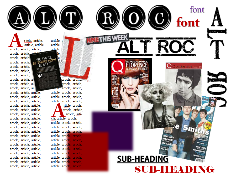
Monday 18 March 2013

Music Magazine Planning: Model Details and Extra

Model:


Leona Hyslop
Contact Details:


Mobile: 07578384429


Screenshots of emails:


Others (Creative inspiration):


Ruth Canning
Contact Details:


Mobile: 07814507037


Screenshots of emails:


Monday 11 March 2013

Music Magazine Planning: Reflection on Planning Process

Looking back at all my planning work, I believe it has been very effective and useful towards my overall product. This is because it has allowed me to carefully and precisely plan out my actions (Gantt Chart) which has allowed me to keep up-to-date on all my work. It has also allowed me to create and see an overview of my magazine and so given me the opportunity to correct and adjust any aspects that need it. I feel I have been very effective at my planning because, without doing so, mistakes may have been made and my FC, CP and DPS may not have been as successful as they will be.
This planning process has allowed me to gain and develop new skills in time-keeping, precision and using new software such as In Design, which are needed and used in the magazine industry.
Another reason this process has been very effective is because I have been able to create several drafts/mock-ups of layouts for my FC, CP and DPS. This has allowed me to decide apon the perfect layout for each page and so appeal to its target audience the best. I have also been able to make this decision due to audience feedback. By conducting several survey's for my layouts and mastheads, I have been able to see which is most preferred by my target audience and so choose layouts and fonts that will attract them and therefore create a magazine that appeals to them in the best and most effective way. This feedback has also allowed me to make changes to my layouts/mastheads where recommended, due to them sharing their opinion with me. This, again, has allowed me to start to create a magazine that best suites my target audience.
My final products are slightly different to how they were planned. This is due to various feedback from students and teachers, as well as my own opinion. My colour scheme has slightly changed to include black and gold instead of black and red. This is because I felt gold made the magazine pages look more professional and more sophisticated and so less like a child's magazine. I have slightly changed my layouts for the magazine pages. This has included removing some graphic features on the DPS and removing some coverlines on the FC. I did this because I felt the pages were too crowded and simplicity would allow the magazine to stand out more and attract my target audience.

Music Magazine Planning: Audience Feedback

From several survey's about my mastheads and layouts, my audience feedback has been very positive and successful. Due to my target market being able to comment on my different fonts for mastheads, I was able to see which was most preferable and why. This is effective as it has allowed me to make a decision on what masthead is best suited for my magazine due to which is most attractive to my target audience (17 to 25 year olds). It has also allowed me to see which layout for my front cover, contents page and double page spread is most appealing to them and so allows me to create a magazine which will be popular to my target audience.
The feedback I have received has also allowed me to make improvements where needed, for example, including more plugs/call outs on my front cover and so make it stand out more and give more information about the magazine. This is very useful because it allows me to create a magazine that I know my target audience will enjoy due to it being created around their feedback.

Music Magazine Planning: Flat Plan


Music Magazine Planning: Mood Board


Music Magazine Planning: DPS Mock Ups


Music Magazine Planning: Contents Page Mock Ups


Music Magazine Planning: Front Cover Mock Ups


Music Magazine Planning: Final Four Mastheads

I like this masthead because it stands out and so draws the reader's attention. This means the magazine is more likely to stand out from other magazines and so be bought. I feel this masthead reflects the 'rock' side of the genre and so links to the magazine well.


This masthead reflects the genre well and so relates to the magazine well. This is effective because it allows the reader to automatically know the genre of the magazine. The use of under and over lines are good as they stand out and so draw the reader's attention. 


 I like this masthead as it is unusual and so draws the reader's attention. However, i'm not sure that it portray's the genre very well and so may be better on the contents page or DPS. 

This is my favorite masthead because it stands out due to the button like circles. I also think it links well with the genre of alternative rock, however, it reflects an 'older' version of the genre and not what we think of alternative rock now.


When I asked my class mates of their preference, they chose the second masthead as their favorite, this is due to it portraying the genre well and standing out, however, I personally prefer the last masthead and think it will be very effective against my central image.

Friday 8 March 2013

Music Magazine Planning: Storyboard

 Front Cover Storyboard:


Front Cover and DPS Storyboard:


DPS Storyboard:


Music Magazine Planning: Masthead Possibilities


Pros:
Bold – this allows the masthead to stand out and so be eye-catching. The boldness allows it to be easily seen over the images/rest of the magazine.
Bright – this is eye catching so draws the reader’s attention.
Simple – This is easy to read and doesn’t take away any focus of the central image/rest of magazine, but still stands out.

Cons:
Too simple – looks slightly boring and not exciting and so readers may be less likely to pick up the magazine. 


Pros:
Represents rock genre due to decaying effect. This is good because it allows the reader to automatically know what genre the magazine is.
Bold which stands out and so draws the reader’s attention.

Cons:
Slightly too thin and so may blend in/not stand out against the central images/rest of cover (however, would look good on contents page).


Pros:
Bold which stands out and is eye-catching which means readers are more likely to pick up the magazine.
The shine on the font is eye-catching which draws attention to the magazine.

Cons:
Doesn’t represent rock very well and so doesn’t automatically tell the reader what they are reading.


Pros:
The use horizontal letters draws the reader’s attention as is unusual. This is good because it allows the magazine to stand out against others.
Represents the genre well due to the decaying effect. This allows the reader know the genre of the magazine straight away.

Cons:
Slightly too thin which means won’t stand out as much.
Perhaps slightly too small – not long enough as preferred to cover width of page.


Pros:
Bold, which stands out and draws attention.
Large and wide so will fit well on FC.

Cons:
Doesn't reflect genre very well and so may be slightly confusing and not as effective.


Pros:
Stands out due to large boarder around text. This is good as it will catch the reader’s eye and so be more likely to be read by standing out.

Cons:
Doesn't reflect genre very well and so may be slightly confusing and not as effective.


Pros:
Bold and eye-catching which is effective for a FC as allows it to stand out against other magazines and so be more likely to be read/bought.

Cons:
Doesn’t reflect genre very well and so may be slightly confusing and not as effective.
Portrays a more ‘arty’ genre, not necessarily music which may be misleading.


Pros:
Represents alternative rock well by portraying a 50’s style.
Stands out well due to large ‘buttons’ which will draw reader’s attention.

Cons:
May not stand out against central image, image will need to have a white/grey background if masthead is to stay black and white., if not, may need to re-think colour of masthead. However, this may not be as effective.


Music Magazine Planning: Props and Costume List

For my front cover, I will include a close up of a model’s face. This may include props such as a tiara or a hat. This is because they link well with my genre of alternative rock. The hat covers some of her face which creates mystery and makes the model seem more superior. This is a tactic many music magazines of the same genre use, for example, Q. The tiara conflicts with the idea of rebellion which rock portrays, this means the cover will stand out.


My model will be wearing a leather jacket which may not be seen due to the close up shot. This represents alternative rock due to it being a symbol of rebellion and rock music. She will also be wearing skinny jeans/leggings and a long, baggy top. These link with today’s fashion, as well as, rock as they too are seen as rebellion and are worn by many rock artists.


On my contents page I will include a few graphic features and one central image. These will use props like guitars and perhaps hats. The guitars represent music and so link well and the hats will be on several band artists and will be used to represent fashion and so appeal to young readers.


Costumes will be jeans, hoodies and leather jackets. These are casual outfits which many male artists wear and so links to actual musicians.


For my DPS I will have a full page central image of my model. She will be sitting on a stool that has a scarf covering it. The scarf makes the stool look appealing and links to the girl model as it will be feminine with swirls, etc. The purpose of the stool is to create an interesting image where we look up at the model. This makes her look powerful which many magazines do to advertise the artist. Her costume will be the same as the FC (same model). This creates continuity and makes the model look familiar and so liked. I may include a guitar leaning against the chair to represent her style of music, or I will include a graphic feature of her playing the guitar to have the same effect. All these images will be shot in a studio which means there will be a lack of props. This is because I want the images to focus on the artists/band and so advertise/promote them, which music magazines usually do.


Images from Google, but similar props will be used in photo shoot.

Music Magazine Planning: Location Recess

Location Recess 1:


Image from Google Search

Location Recess 2:


Image from Google Search

Location Recess 3:


Music Magazine Planning: Gantt Chart