My survey also showed me
that the three most popular features my target audience expect to see are
interviews (89%), new releases reviews (89%) and coverage of festivals/gigs
(78%). This means that I will try to include such features on my front cover,
contents page or my DPS to appeal to my audience.


The results illustrated that
the most popular feature on a DPS is Band coverage/interviews (67%) with gigs/festival
information just behind (56%). This has suggested to me to create a DPS that
includes a major interview with a band/artist and perhaps add a list of
festival information at the side or on the contents page.


I received many
suggestions of pricing for my magazine with £2.00 being the most popular.
However, due to secondary research, I can see that many other music magazines
are priced over £3.00. Because of this, I have decided to go against my primary
research and raise the price to £2.70 which is a balance between what my target
audience wants and what other magazines (competition) are priced at.

My
questionnaire showed that my target audience would like to see a band on both
the front cover and DPS. This is due to when I asked “What Alternative Rock artists do
you like/listen to, if any?” most answers included bands, not single artists
and are therefore more popular.

For a colour scheme, my survey showed that my target audience preferred a dark colour scheme (45%) throughout the magazine. this may be because it represents alternative rock the best. From my secondary research I discovered the magazine “Mojo” of which shares the same genre. They too used a dark colour scheme and so from both my primary and secondary research, I can see that a dark colour scheme is best suited.

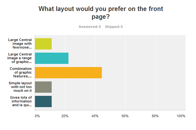
I have learnt, that for my
front cover, a layout that includes a combination of graphic features, a
central image, pull quotes and flashes are most popular with my target audience
(44%).

I also learnt that the majority of my target audience, if not all, listen to music trough their mobile phones and iPods (100%). From these results, I can conclude that my audience would enjoy seeing a flash, graphic feature, pull quote, etc on my front cover about music through technology. For example, new releases on iTunes for your iPod.

I also learnt that the majority of my target audience, if not all, listen to music trough their mobile phones and iPods (100%). From these results, I can conclude that my audience would enjoy seeing a flash, graphic feature, pull quote, etc on my front cover about music through technology. For example, new releases on iTunes for your iPod.

My results show that my
target audience prefer their contents page layout to be dominated by text but
include a few graphic features (78%). From this result, I may use the
convention of a contents list down one side of the page with graphic features on
the other side. I may also include anchorage to give meaning to the images as
my target audience prefer text.


Finally, my questionnaire
showed that my target audience would like the DPS to include a large image
(56%) and perhaps some pull quotes (45%). From my secondary research, I found that
many DPS’s used full page central images with the article on the page next to
it. From these results, I may use a fill page central image and perhaps a pull
quote between the article text to make it look more interesting and appealing.


From my questionnaire
results, I have gained many suggestions on how to lay out my front page,
contents page and DPS, including what colour scheme to use and what articles to
include.
For questionnaire questions: http://www.surveymonkey.com/s/7WY3VDJ
No comments:
Post a Comment