Rock Sound:
This double page spread
uses the convention of a full page central image which is also a bleed. This is
effective because it draws attention to the readers and makes the article more
interesting and attractive. There is also a large, bold masthead “Teen Spirit”
this is another convention of DPS’s because it is eye-catching and clearly
informs the reader of what the article is about; the central image has this
effect too. There is drops capital at the beginning of the article text. This
makes the text more interesting/attractive. It is also in a different colour to
the rest of the article which makes it stand out and so is more appealing and
eye-catching. The DPS uses a callout to make it more interesting and appealing.
This is a convention in many DPS’s. The page uses a range of colours and fonts
to make it look more attractive and interesting. This will draw reader’s
attention so they are more likely to read the article.

Q:
This DPS uses a very
popular convention of a full page central image. This attracts the audience to
the article by making it look more visually appealing and so more interesting.
This also allows the reader to instantly know who the article is about. This is
effective because they can then easily decide if they want to read the article
or not. The DPS uses page numbers which gives the reader additional information
and makes it easy for them to navigate the magazine. There is also a drops
capital in the article; however it is half way through the text not at the
beginning. This has many effects. Firstly, it is more visually appealing and
makes the text look more interesting. It may also imply a new
location/subject/etc in the story. This is useful because it clearly shows the
different sections to the articles and so makes it easier for the reader is
looking for a particular part of the story. The DPS includes a header “Florence

NME:
This DPS includes the
typical full page central image which is attractive and eye-catching as well as
informative to the audiences – shows them who the article is about. Another convention is the bold masthead “The
Vaccines” which also informs the audiences who the DPS is about. This is
expected of a DSP as it automatically tells the reader what they are going to
read and so allows them to decide if they want to read it or not. Another
convention is the drops capital. In this DPS it is used at the beginning of the
article and half way through. This makes the text more eye-catching and
therefore interesting. The second drops capital may imply a new
location/setting/etc and clearly shows the reader’s of this by standing out.
Not only does it stand out by being larger than the other test, but it is also
a different colour. This makes it more appealing and so more interesting. There
is also a callout within the article which is represented larger and in a
different colour. This allows it to stand out and draw the reader’s attention.

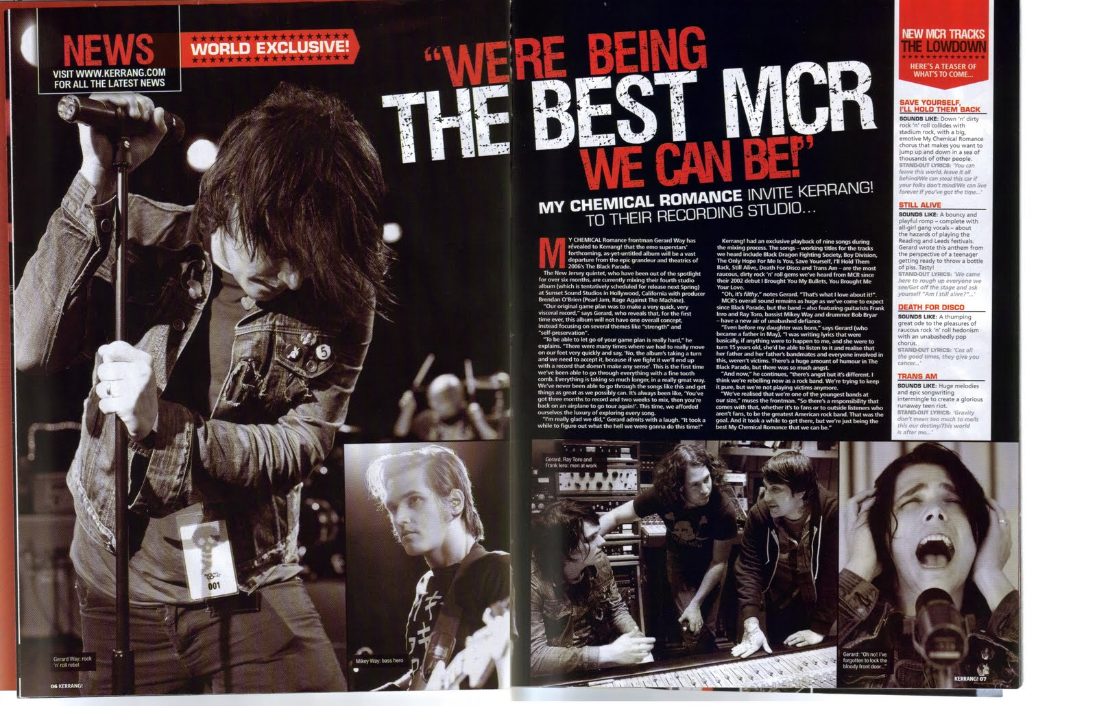
Kerrang:
In this double page spread
there is a large callout which is used as a masthead “We’re being the best MCR we
can be!” This is effective because it draws the reader’s attention and is
visually appealing. A typical convention used in this DPS is a full page
central image. This is also visually appealing and makes the DPS look more
interesting and so is more likely to be read. It also includes graphic features
which have the same effect. They also give the reader more information about
the band/feature. For example, showing the reader’s what the band members look
like and what environment they tend to be in (studio). This is effective
because it draws the reader’s attention and gives them a range of images to
relate to the text which makes it more interesting and appealing. These graphic
features are accompanied by anchorage. This helps create meaning to the images
and so make them more interesting and appealing. Another convention is the
drops capital used at the beginning of the article. This draws reader’s
attention and is visually appealing. The DPS also includes a skyline “World
exclusive”. This draws reader’s attention and make the article more appealing
and interesting and so more likely; to be read.
Mojo:
This DPS uses a
callout/pull quote as a masthead. This is effective because it draws the
reader’s attention and makes the DPS look more appealing and interesting. The
use of a masthead is a convention in DPS’s as it stands out and so attracts
attention as well as informing the reader of what/who the article is bout.
There is a skyline at the top of the left page “The 50 Greatest Neil Young
Songs”. This gives the reader extra information about the DPS and so allows
them to decide of they want to read it or not. It is also visually appealing
and makes the article look more interesting. In the skyline the number “50” is
shown in a different colour to the rest. This highlights the number and so
draw’s the reader to it. This effect is used in the masthead where the words
“be there now” are a different colour compared to the rest of the masthead. This
may signify an important aspect of the singer and so relate to the audience
which is appealing and eye-catching and so makes them more likely to read the
DPS. Another convention is the use of a full page central image. This is
attractive and eye-catching and so interests the reader and makes the DPS look
more appealing and interesting. Accompanying this central image is an
anchorage. This helps create meaning for the image and is used in many magazines.
Another convention is the drops capital at the beginning of the article. This
is eye-catching and so draws the reader’s attention and makes them more likely
to read it. The singers name and others have been highlighted in a different
colour to the text. This draws the reader’s attention and reminds them of who
the article is about. This is effective because it allows the reader to be
tempted into reading the article by being reminded who they are reading about.

No comments:
Post a Comment